Improving Multivariate Behaviour Definition in Timeseries Datasets
I was enjoying some downtime between roles and was reading about the fantastic work in the TimeCluster workflow. It has me thinking about how I could utilise similar techniques in future Industrial time-series problems, which are super interesting to me.
I’ve tackled a few of these problems now and have the following reflections:
- Better features beat better algorithms 80% of the time
- Classification and detection of fault states are typical use cases
- Interesting process states are often multidimensional and unlabeled - therefore hard to train against
- Dimensional Reduction and Clustering can be a potent workflow, but only if you can isolate behaviours
Whilst on site, I often ‘felt’ like we should have been able to detect these complex patterns representing states like ‘high magnetite consumption’ or ‘screen blinding’ but frequently struggled to get the signal from the data to confirm this. I found that Seeq’s Multivariate Pattern Search is an excellent tool when I know a state I’m looking for and have an example - extending the already magic-like univariate pattern search. It’s a kick-ass product, but what if I want an overview of all states? MPS doesn’t tell me the unknown unknowns of a systems behaviour. That’s why I wanted to implement a critical insight of TimeCluster, specifically, utilising a sliding time window to capture the multidimensional and time-dependent nature of process states. From here, I can completely observe a process’ global behaviour and states. For the data, I’ve spent a bit of time during garden leave in the gym on a bike - and I’ll be using my Strava data as the basis of this post - ultimate #StravaWanker behaviour.
Data
You can download a copy of your Strava profile via this kb, specifically under ‘Bulk Export’. Going through the API was more pain than it was worth, but if you wanted to do something more permanent, I’d go down that route.
Strava data is recorded in a mix of old .gpx activities and newer .tcx.gz —”Training Center XML”—files. The .tcx.gz files can be unzipped and read in-place with an inline gzfile call. This code isn’t too exciting, it just navigates into each file and returns a summary statistics dataframe with the timeseries nested into it.
Interesting parts:
- Generating standard deviation features for
cadence:wattsusingacrossas a measure of total variability - Generating a local, rolling standard deviation of cadence variability (
roll_cadence_sd) using the crackingRcppRolllibrary.
Sample Extract
                       time   distance   cadence  heart rate   watts   cadence_sd   heartrate_sd   watts_sd   roll_cadence_sd   duration
         ------------------ ---------- --------- ----------- ------- ------------ -------------- ---------- ----------------- ----------
	   2024-03-20 11:59       7470        70         156     168        1.57          17.02       9.35              1.16        1192
	   2024-03-20 11:59       7490        69         156     166        1.57          17.02       9.35              0.99        1194
	   2024-03-20 11:59       7500        70         156     168        1.57          17.02       9.35              0.99        1196
	   2024-03-20 11:59       7520        69         156     166        1.57          17.02       9.35              0.99        1198
	   2024-03-20 11:59       7520        68         156     163        1.57          17.02       9.35              0.79        1199
	   2024-03-20 11:59       7530        68         156     163        1.57          17.02       9.35              0.79        1200
	rides = fs::dir_ls("data_2024/activities", regexp = "gz") %>% map(~read_html(gzfile(.)))

	extractor = function(file){
			  activity = file %>%
	  	    html_node("body") %>%
	    	    html_node("trainingcenterdatabase") %>%
	    	    html_node("activities") %>%
	    	    html_node("activity")

	  sport = activity %>% html_attrs()
	  	  id = activity %>% html_nodes("id") %>% html_text()

	  total_time_seconds = activity %>% html_nodes("totaltimeseconds") %>% html_text()
  	  distance_meters = activity %>% html_nodes("distancemeters") %>% html_text() %>% magrittr::extract2(1)
  	  calories = activity %>% html_nodes("calories") %>% html_text()
  	  intensity = activity %>% html_nodes("intensity") %>% html_text()

	  trackpoints = activity %>% html_nodes("trackpoint")

	  tp_time = trackpoints %>% html_nodes("time") %>% html_text()
  	  tp_distance = trackpoints %>% html_nodes("distancemeters") %>% html_text()
  	  tp_cadence = trackpoints %>% html_nodes("cadence") %>% html_text()
  	  tp_heartrate = trackpoints %>% html_nodes("heartratebpm") %>% html_text()
  	  tp_watts = trackpoints %>% html_nodes("watts") %>% html_text()

	  # check if cadence or watts are empty
  	  tp_cadence = if(is_empty(tp_cadence)) NA_character_ else tp_cadence
  	  tp_watts = if(is_empty(tp_watts)) NA_character_ else tp_watts

	  # write summary statistics df
  	  df_trackpoints = tibble(
  		    time = tp_time,
    	    distance = tp_distance,
    	    cadence = tp_cadence,
    	    heartrate = tp_heartrate,
    	    watts = tp_watts
    	  ) %>%
  	    mutate(across(distance:watts, as.numeric),
    	           time = time %>% ymd_hms(tz = "Europe/London", quiet = T),
           	           across(cadence:watts, list(sd = sd)),
           	           roll_cadence_sd = roll_sdr(cadence, n = 10),
           	           duration = (time - min(time)) %>% as.numeric()
           	    )

	  df_id = tibble(
	  		    id = id,
	    	    sport = sport,
	    	    total_time_seconds = total_time_seconds,
	    	    distance_meters = distance_meters,
	    	    calories = calories,
	    	    intensity = intensity,
	    	    data = list(df_trackpoints)
	    	  ) %>%
	  	    mutate(across(total_time_seconds:calories, as.numeric),
	    	           id = id %>% ymd_hms(tz = "Europe/London", quiet = T))

	  df_id

}
Baseline Performance
We now have the dataset ready for the sliding window assessment. Before we get ahead of ourselves, let’s look at the baseline first, a naive UMAP application to the time-series data. I’m using UMAP as it’s super effective and my trusty, go-to, one-line dimensional reduction library before clustering.
- PCA’s is fast and a classic but is routinely outperformed by more modern, non-linear techniques
- TSNE’s time in the sun is over as inter-cluster distances and global structure are not well conserved
- VAE’s, DCAE’s and TDA can be more performant but can be a configuration quagmire
	# Baseline UMAP
		df_umap_baseline_input = all_rides %>%
		  filter(sport == "Biking",
	  	         total_time_seconds <= 1200) %>%
	         	  select(id, data) %>%
	  	  unnest(cols = c(data)) %>%
	  	  na.omit()

	df_umap_baseline = df_umap_baseline_input %>%
			select(-id, -duration, -time, -distance) %>%
			  mutate(across(where(is.numeric),  scale)) %>%
				na.omit() %>%
				umap::umap() %>%
				magrittr::extract2("layout") %>%
				as.data.frame() %>%
				set_names(nm = c("UMAP1","UMAP2")) %>%
				bind_cols(df_umap_baseline_input)

	df_umap_baseline %>% ggplot(aes(x = UMAP1, y = UMAP2))+
		  geom_density2d_filled()+
	  	  dark_theme+
	  	  geom_point(show.legend = F, aes(colour = duration))+
	  	  scale_colour_viridis_c(option = "A")+
	  	  labs(fill = "Density",
	  	       title = "Baseline UMAP Struggles To Differentiate Behaviour" ,
	       	       subtitle = "Some clustering by present",
	       	       colour = "Duration (s)",
	       	       source = "Strava")
Which yields:
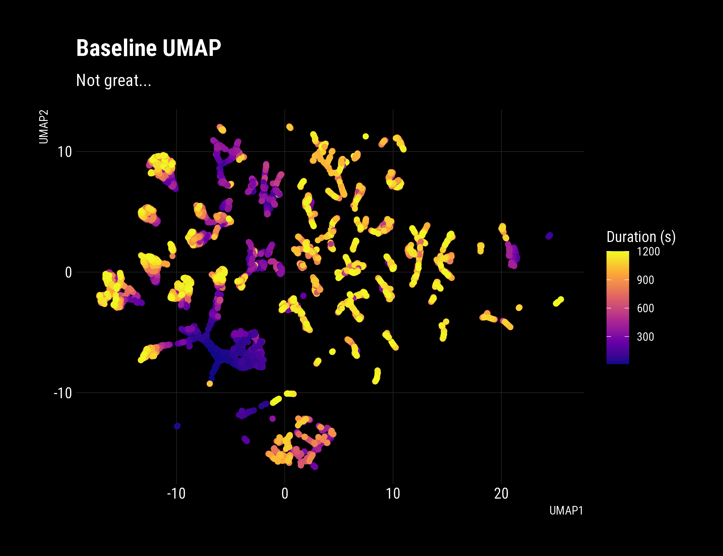
My Verdict:

A density based clustering algorithm like HDBSCAN is going to really struggle with a data-set like that.
Time Slices
Let’s see how this feature engineering technique performs compared to that recalcitrant baseline.
Ok, we’ve established out baseline and we have a time-series dataframe that was ready for the next time slice feature generation step. We take the last n points in history and pivot them into a wide, single-row dataset.
i.e. take a M x N dataset from time i to i-M and transfer it into a 1 x (MxN) observation for i.
For example:
     time   speed   power
   ------ ------- -------
	1      50      70
	2      55      72
	3      60      68
becomes:
    `1_speed`   `2_speed`   `3_speed`   `1_power`   `2_power`   `3_power`
   ---------- ----------- ----------- ----------- ----------- -----------
           50          55          60          70          72          68
This transformation is very similar to how the classic MNIST digits dataset is preprocessed from a matrix to a vector before training. This is important because we can now capture the system’s time dynamics, and sequential observations will be nearer in latent space, giving us better clustering targets.
My implementation is pretty slow and clunky. I’m certain this could be improved with SQL joins and nesting the result, but I’m not a data engineer, and performance isn’t a high priority. Note: I dropped duration and distance as monotonically increasing variables will spaghettify latent spaces and obscure clusters.
constructor = function(df, window = 10){

	  df_x = map(seq(from = window, to = nrow(df)),
	   ~slice(df, (.-window):(.-1)) %>%
	               mutate(n = row_number()) %>%
	               select(-duration, -distance) %>%
	               pivot_wider(values_from = everything(),
	                           names_from = n,
	                           names_vary = "fastest",
	                           names_glue = "{n}_{.value}")
	  )

	  df_x = df_x %>%
	    bind_rows() %>%
	    distinct() %>%
	    select(-c(`2_time`:`9_time`),-`10_time`)
	}

	all_rides = rides %>%
	  map(extractor) %>%
	  bind_rows() %>%
	  rowwise() %>%
	  mutate(umap_input = constructor(data) %>% list())

	df_umap_input = all_rides %>%
	  filter(sport == "Biking",
	         total_time_seconds <= 1200) %>%
	  select(id, umap_input) %>%
	  unnest(cols = c(umap_input)) %>%
	  na.omit()

	# Baseline UMAP
	df_umap_baseline_input = all_rides %>%
	  filter(sport == "Biking",
	         total_time_seconds <= 1200) %>%
	  select(id, data) %>%
	  unnest(cols = c(data)) %>%
	  na.omit()
umap_data = df_umap_input %>% select(-`1_time`, -id) %>% umap::umap()
df_umap = df_umap_input %>%
bind_cols(
umap_data$layout %>%
as.data.frame() %>%
set_names(nm = c("UMAP1","UMAP2"))
) %>%
group_by(id) %>%
mutate(duration = (`1_time` - min(`1_time`)) %>% as.numeric()) %>%
ungroup()
# Show that the sliding window technique reveals state and trajectory
df_umap %>%
mutate(id = id %>% as.Date()) %>%
ggplot(aes(x = UMAP1, y = UMAP2))+
dark_theme+
geom_point(aes(colour = id), show.legend = F)+
scale_colour_viridis_c(option = "C",
labels = as.Date)+
labs(title = "Tactics Changed Over Time",
subtitle = "Early rides are unusual, later rides show more consistency",
colour = "Date")
# Show that the sliding window technique improves density
df_umap %>% ggplot(aes(x = UMAP1, y = UMAP2))+
geom_density2d_filled(bins = 5)+
dark_theme+
geom_point(data = df_umap, aes(colour = `duration`), show.legend = F)+
scale_colour_viridis_c(option = "A")+
labs(fill = "Density",
title = "Sliding Window Preparation Reveals Evolving Tactics",
subtitle = "Coloured by time into ride(s), recent rides smoothly transition to a steady state",
colour = "Duration (s)")
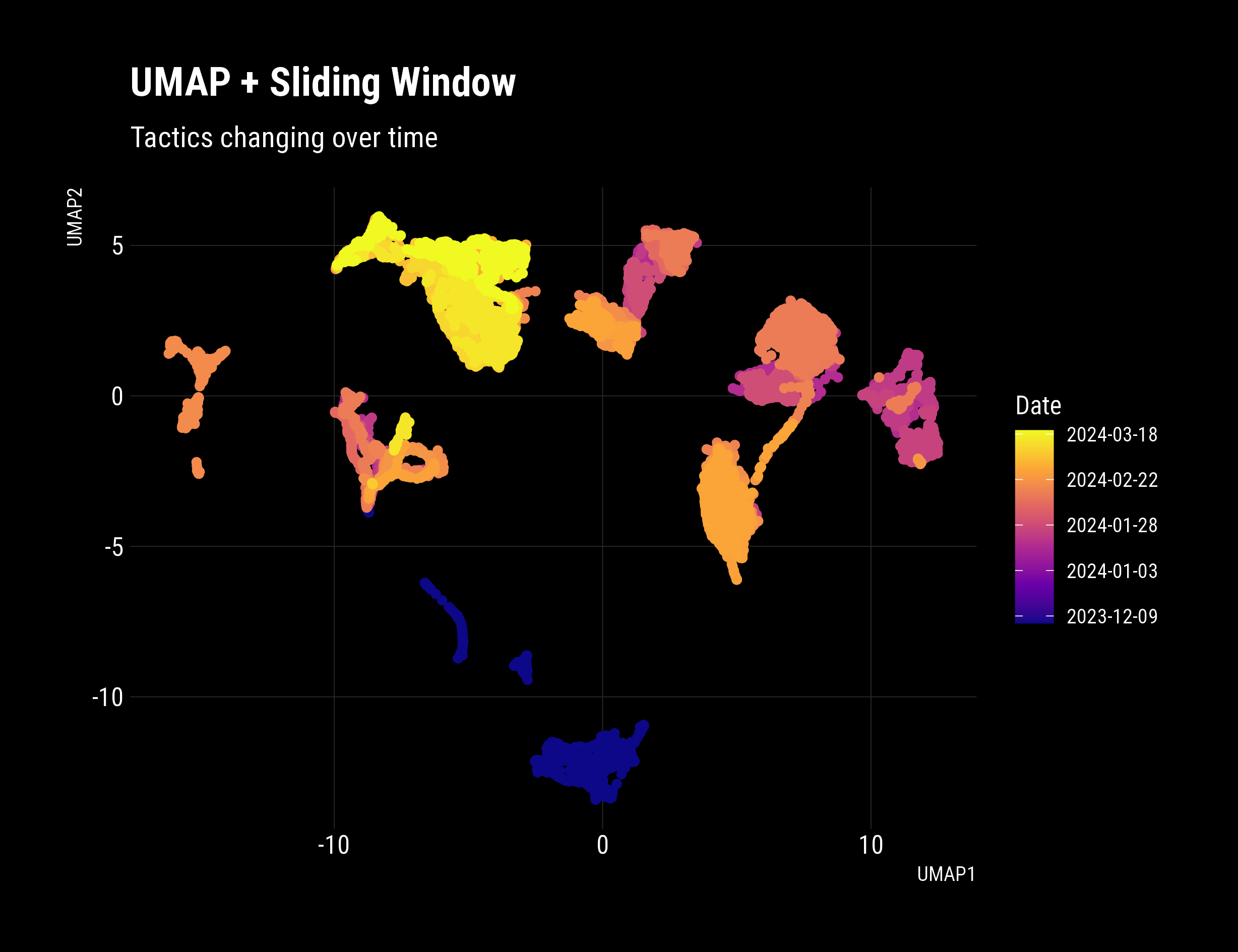
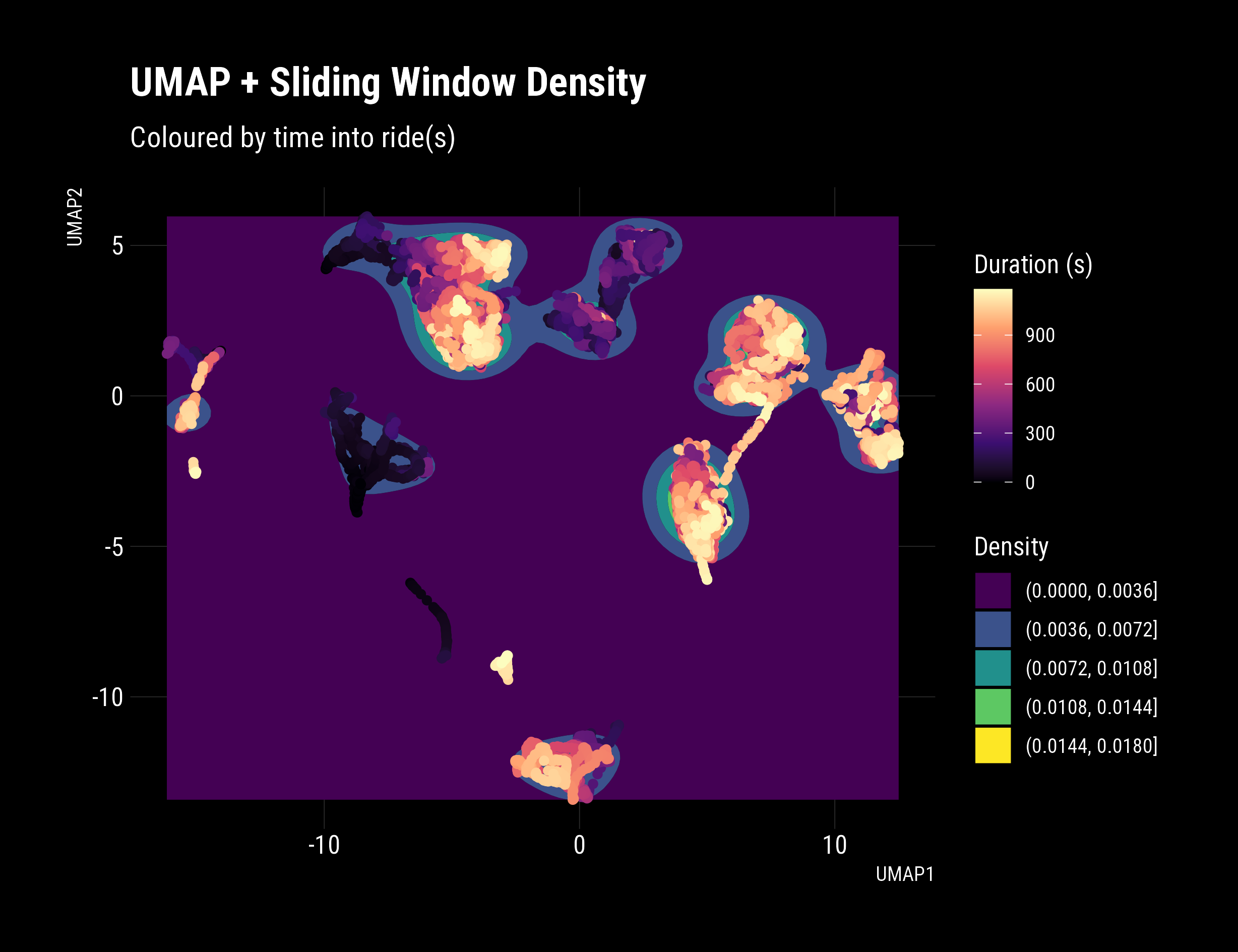
That’s a real, significant improvement. Distinct behaviours are evident, with clear clusters and good density. The date and time were not included in the Umap input dataset. The plot reveals that behaviour/tactics are changing over time, which is accurate and promising! Pleasingly, in newer rides, a clear transition occurs during the ride, with smoothly connected paths in latent space. Extracting these insights is precisely what this technique excels at revealing.
From here, we’ll apply some HDBSCAN clustering to pick out clusters to label our data set, enabling classification use cases and training.
	# Clustering
		clusters = df_umap %>%
			select(contains("UMAP")) %>%
			hdbscan(minPts = 150)

	df_umap_clusters = tibble(
		cluster = clusters$cluster,
		outlier_score = clusters$outlier_scores) %>%
		bind_cols(df_umap)

	# Cluster Behaviour
		df_umap_clusters %>%
		  ggplot(aes(
		  				x = UMAP1,
		  		 		y = UMAP2,
	  		            colour = cluster %>% factor()
	  		            ))+
	             	  geom_point(shape = 19, size = 2, aes(alpha = -outlier_score))+
	  	  dark_theme+
	  	  scale_colour_viridis_d(direction = -1)+
	  	  labs(colour = "Cluster",
	  	       title = "Clusters of Behaviour",
	       	       subtitle = "HDBSCAN clustering",
	       	       alpha = "Outlier Probability")+
	       	  geom_label(data = df_umap_clusters %>%
	  		               filter(cluster != 0) %>%
	               	               group_by(cluster) %>%
	               	               select(UMAP1, UMAP2) %>%
	               	               summarise(across(everything(),median)),
               	             aes(label = cluster),
             	              colour = "black",
              	              alpha = 0.5,
              	             position = position_dodge(0.9))
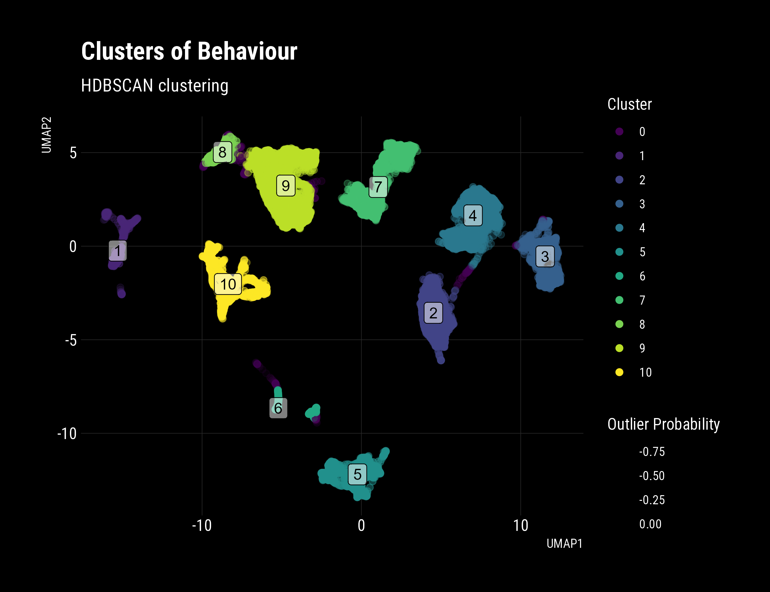
There we have it! Labelled clusters of behaviour. You can clearly see;
- My odd beginning rides way out to the bottom (5-6)
- Improving performance and different tactics (1-4,7)
- Newer tactics with continuous connections (8-9)
- Interestingly, it looks like there are similar pairs of clusters (3-4, 8-9)
- Is this is the difference between the two machines I routinely use?
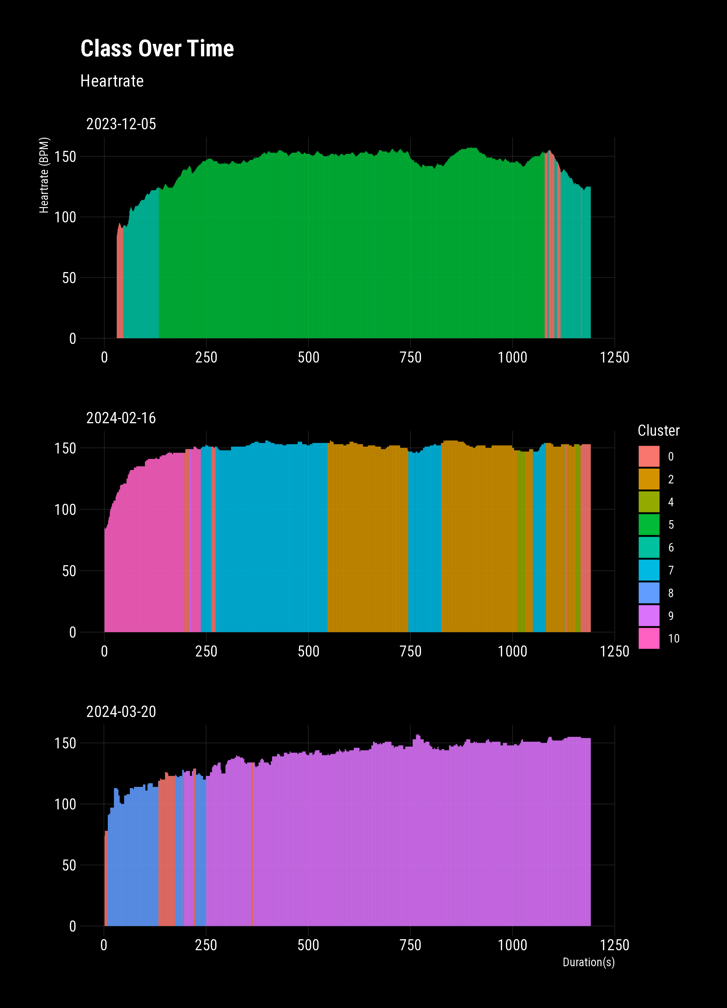
To complete the example, I’ll plot univariate heart rates from three separate rides with their classes. This clearly shows the changing multivariate behaviour, e.g., power:cadence, cadence variability, heart bpm rate of change, etc. While I’ve applied this to a contrived data set with no parameter optimisation, this technique can easily be applied to industrial data sets and pull-out global states.