I am exploring the idea of purchasing a property in Brisbane and am thinking through parameters that impact pricing. In my opinion, travel time to the CBD should be an input. To explore that idea; I needed first to map travel times. This post will go through the process of using geo-computational tools in R and Google Maps to answer this question.
Data
Local Government Areas Local Government Areas ASGS Ed 2019 Digital Boundaries in ESRI Shapefile Format
Setting the boundaries
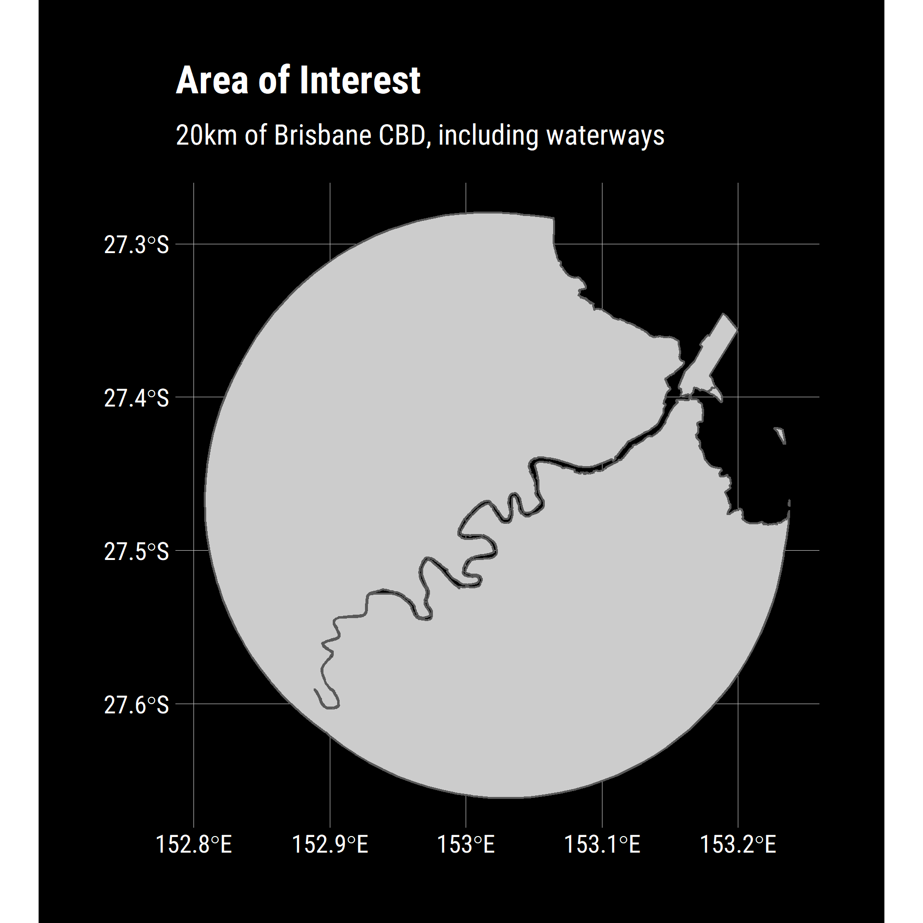
I don’t want to map the entire state, only a region within 20km of the CBD. To reflect this, I am going to filter down to only the CBD then generate a buffer for use as a mask and transform everything into EPSG:4326 as this is what I will ultimately send to Google’s Distance Matrix API.
pacman::p_load(tidyverse, sf, glue)
# See previous posts for code
source("dark_theme.R")

# Load the waterways shapefile first so its available in the following pipe
water_ways = "data/river/LGA_2019_AUST.shp" %>%
  st_read() %>%
  filter(STE_NAME16 == "Queensland") %>%
  st_union() %>%
  st_transform(crs = 4326)

BNE = "data/boundaries/data.gpkg" %>%
  st_read() %>%
  filter(LOCALITY == "Brisbane City") %>%
  st_buffer(dist = units::set_units(10, km)) %>%
  st_transform(crs = 4326) %>%
  st_intersection(water_ways)

BNE %>%
  ggplot() +
  geom_sf(fill="grey80") +
  dark_theme+
  labs(title = "Area of Interest",
       subtitle = "10km of Brisbane CBD, including waterways")
ggsave(
  "plot/01 AOI.png",
  width = 5,
  height = 5,
  units = "cm",
  dpi = 320,
  scale = 3,
  bg = "transparent"
)
The Distance Matrix API (https://developers.google.com/maps/documentation/distance-matrix/start) I was planning on using, takes multiple origins and destination points and returns a JSON array with the key data I want.
For simplicities sake, I used a single origin and destination for each API call. The destination was obvious, the enduring spiritual epicentre of Brisvegas - Queen Street Mall Hungry Jacks, but I needed a grid of starting points to complete the API calls.
{
   "destination_addresses" : [ "New York, NY, USA" ],
   "origin_addresses" : [ "Washington, DC, USA" ],
   "rows" : [
      {
         "elements" : [
            {
               "distance" : {
                  "text" : "225 mi",
                  "value" : 361715
               },
               "duration" : {
                  "text" : "3 hours 49 mins",
                  "value" : 13725
               },
               "status" : "OK"
            }
         ]
      }
   ],
   "status" : "OK"
}
For my gridded search, I compromised on a spatial resolution of 400m so as to not exhaust my API allocation but still have enough fidelity to identify trends.
spacing = 400 #m
width = 40000 #m
n_length = width / spacing

stopifnot(nlength^2 < 20000)
I used the awesome purrr:cross_df function to combine a list of latitudes and longitudes into a combination of points in a data frame, and by intersecting with the BNE object, I drop points that are not on land.
I deliberately did not use sf::st_make_grid, it was simply faster and cleaner to use cross_df in this particular use case.
destination = c(x = 153.025240,
                y = -27.469652)

destination_df = data.frame(x = destination['x'],
                         y = destination['y']) %>%
  st_as_sf(coords = c("x","y"),
           crs = 4326)

bbox = BNE %>% sf::st_bbox()

grid = list(x = seq(from = bbox[["xmin"]],
                    to  = bbox[["xmax"]],
                    length.out = n_length),
            y = seq(from = bbox[["ymin"]],
                    to  = bbox[["ymax"]],
                    length.out = n_length)) %>%
  cross_df()

grid_sf = grid %>%
  st_as_sf(coords = c("x","y"),
           crs = 4326) %>%
  st_intersection(BNE) %>%
  select(geometry)

grid_sf %>%
  ggplot() +
  dark_theme +
  geom_sf(data = BNE, fill = "grey80")+
  geom_sf(colour = "white", size = 0.2) +
  geom_sf(data = destination_df, colour = "red") +
  labs(title = "Gridded points across Brisbane",
       subtitle = "Origins in white, destination in red")

ggsave(
  "plot/02 Grid.png",
  width = 5,
  height = 5,
  units = "cm",
  dpi = 320,
  scale = 3,
  bg = "transparent"
)

Building the API Call
I already have a developer account with Google for past projects, so I only needed to create new credentials and restrict them to the Distance Matrix API. I am not going over this; there is plenty of great documentation online.
There are a few things to be aware of when using this API:
- No spaces between latitudes and longitudes.
- Specified as Latitude then Longitude.
- Default units are metric, but I prefer to be explicit.
- Departure times need to be in the future (They were when I wrote the code).
- Append your API key last.
- Use ‘&’ for concatenation.
df_grid = grid %>%
  mutate(
    origin_string = glue("origins={y},{x}"),
    destination_string = glue("destinations={destination['y']},{destination['x']}"),
    units = "units=metric",
    departure_time = glue(
      "departure_time={lubridate::ymd_hms('2020-04-14 23:00:00') %>% as.numeric()}"
    ),
    key = glue("key={api}"),
    joined = str_c(
      origin_string,
      destination_string,
      units,
      departure_time,
      key,
      sep = "&"
    ),
    url = str_c(base, joined)
  )
This returns a data-frame containing URLs like this:
> df_grid$url[[1]]
[1] "https://maps.googleapis.com/maps/api/distancematrix/json?origins=-27.5711210817823,152.90931838382&destinations=-27.469652,153.02524&units=metric&departure_time=1586905200&key=TOTALLY_NOT_MY_API_KEY"
Calling the API
With the data frame of points, I mapped over the URL column and stored the GET request as a list-column. I wrote a small helper to delay the calls, mainly so that I could verify that I wasn’t running up a terrifying bill then push the result out to a .RDS file in case I needed it later.
n = nrow(df_grid)
i = 1

delayed_get = function(x){
  message(scales::percent((i / n), 0.01))
  Sys.sleep(0.2)
  i <<- i + 1
  httr::GET(x)
}

df_GET = df_grid %>%
  select(x, y, url) %>%
  mutate(json = map(url, delayed_get))

df_GET %>% saveRDS("df_GET.rds")
I wrote another helper function to parse the JSON tree structure.
I really like this design pattern of simplifying the problem into discrete steps, write a function to solve an individual case then map the solution to all inputs and repeat. I find the tidyverse packages really support this paradigm.
df_json = function(x){
  x %>%
    content("text") %>%
    jsonlite::fromJSON( simplifyDataFrame = T) %>%
    as.data.frame() %>%
    .$elements %>%
    as.data.frame() %>%
    flatten()
}

df_content = df_GET %>%
  mutate(data = map(json, df_json)) %>%
  select(x,y, data) %>%
  unnest()

df_content %>% saveRDS("export/df_content.RDS")
df_content %>% write_csv("export/df_context.csv")
Plotting the results
From here, it is straightforward to plot simply as points in ggplot. For my model, however, I took the CSV into QGIS and used a TIN interpolation to fit a surface and fill in the distance between observations then bring this TIF back into R as a raster.
A couple of neat observations:
- There is a clear corridor along the M3 in the South West corner
- Travel timely is generally proportioanl to distance (as expected) by there are some isolated pockets in the North West and West that are above expected duration.
- Interesting to see asymetry depending on the side of the river (Bulimba / Teneriffe)
df_content %>%
  mutate(Minutes = duration_in_traffic.value / 60) %>%
  ggplot() +
  geom_point(aes(x = x,
                 y = y,
                 colour = Minutes), size = 0.5) +
  scale_colour_viridis_c() +
  dark_theme +
  geom_sf(data = destination_df, colour = "red") +
  labs(title = "Driving time to Brisbane CBD",
       subtitle = "Duration in Monday morning traffic",
       fill = "Minutes")+
  ggthemr::no_axes_titles()

ggsave(
  "plot/03 Traffic.png",
  width = 5,
  height = 5,
  units = "cm",
  dpi = 320,
  scale = 3,
  bg = "transparent"
)
