SupeR: Trust but Verify
I was doing a routine review of my finances recently and wanted to know how my Superannuation was performing relative to other funds. I am a firm believer in the utility of benchmarking in the metallurgical world so why not bring this idea home and see how my fund is doing.
To benchmark, however, you need data. Luckily, the Australian Prudential Regulation Authority (APRA) do great work and publish Annual Fund-level Superannuation Statistics and importantly, the data isn’t locked up in a PDF but in a standard, wide-format xlsx file.
To load this data into R, I used the $readxl$ package, however, on a messier data set, I would have opted for $tidyxl$ which decomposes a workbook into a very primitive, tidy format.
A quick look at the file structure indicates that the data needed some basic tidying on the import step.

Some of the issues with this file from a data import perspective:
- Headers start in row 5, not row 1
- There are blank rows between the header and the data (rows 6-7)
- Not all columns are uniquely named
- Headers are optimised for readability, not programming (contain spaces, apostrophes, mixed cases and other unusual text artefacts)
To clean the column names, I used regular expressions to efficiently find and replace the undesirable characters and specify the ‘skip’ and ‘na’ arguments of the ‘read_xlsx’ function.
pacman::p_load(tidyverse, readxl, hrbrthemes, ggthemr)

# Regex helper, first line matches are replaced with an underscore
# second line matches are replaced with null and are effectively removed
clean = c("( +|\n|-)"  = "_",
          "(\r|'|’|:)" = "")

table_2 = read_xlsx("data/2018-AFLSS-201706.xlsx",
                    sheet = "Table 2",
                    skip = 4,
                    na = "*") %>%
  set_names(str_replace_all(str_to_lower(names(.)), clean)) %>%
  filter(!is.na(fund_name)) %>%
  mutate_at(vars(total_assets:growth_in_number_of_member_accounts), as.numeric)
As always, I used the pipe operator from dplyr ($\%>\%$) to send the output of one function to the inputs of the next. This gives us a clean dataframe that looked like below:
table_2 %>% glimpse()
Observations: 199
Variables: 27
$ fund_name                                     <chr> "Advance Retiremen" ...
$ abn                                           <dbl> 95068282166, 7875737...
$ rse_regulatory_classification                 <chr> "Public offer", "Pu"...
$ fund_type                                     <chr> "Retail", "Retail", ...
$ rse_membership_base                           <chr> "General base", "Ge"...
$ funds_rse_licensee                            <chr> "BT Funds Managemen"...
$ rse_licensee_ownership_type                   <chr> "Financial service" ...
$ rse_licensee_profit_status                    <chr> "For profit status",...
$ rse_licensee_board_structure                  <chr> "Non equal represen"...
$ rse_balance_date                              <dttm> 2017-06-30, 2016-11...
$ duration                                      <chr> "12", "12", "12", ""...
$ rse_wind_up_date                              <dttm> NA, NA, NA, NA, NA,...
$ total_assets                                  <dbl> NA, 7850, 2113546, 5...
...
Table 3, unfortunately, didn’t play nice and when we clean the column names, I got a collision. Dplyr dutifully throws an error stating that you can’t have two columns in a dataframe with the same name. To prevent this, I preempted the problem and prefixed the offending column (60) with its category (investment). This workaround breaks the pipeline but made my life easier.
table_3 = read_xlsx("data/2018-AFLSS-201706.xlsx", sheet = "Table 3", skip = 4, na = "*")
names(table_3)[60] = "investment_associated_with_service_provider_expenses"

table_3 = table_3 %>% set_names(str_replace_all(str_to_lower(names(.)), clean)) %>%
  filter(!is.na(fund_name)) %>%
  mutate_at(c(13, 56:79), as.numeric) %>%
  mutate(investment_expenses_ratio = (investment_expenses_associated_with_investment_management_base_fee+
                                           investment_expenses_associated_with_investment_management_performance_based_fee+
                                           custodian+
                                           investment_consultant+
                                           investment_associated_with_service_provider_expenses+
                                           other_investment_expenses)/ cash_flow_adjusted_net_assets,
         operating_expense_ratio = (total_administration_and_operating_expenses + advice_expenses) / cash_flow_adjusted_net_assets)
The original table reports the Operating Expense Ratio rounded to 1 decimal place and lost a lot of detail, thankfully, however, the calculation is documented, and I could recreate it. Note, however, that Advice Expenses (column BV) were excluded from the default calculation. This difference skews the real operating costs as this is a large part of some funds expenses (see below). Advice fees have been included into the re-calculated operating expense ratios to account for the difference.

df = table_3 %>%
  inner_join(select(table_2, abn, five_year_rate_of_return,ten_year_rate_of_return)) %>%
  mutate_at(vars(five_year_rate_of_return,ten_year_rate_of_return), as.numeric) %>%
  filter(!is.na(five_year_rate_of_return)) %>%
  mutate(operating_performance_ratio = five_year_rate_of_return / operating_expense_ratio,
         investment_performance_ratio = five_year_rate_of_return / investment_expenses_ratio) %>%
  filter(operating_performance_ratio != Inf)
I now had two tables, one with the returns data and the other with the fee data. I used a SQL style inner join on the ABN to create a new dataset with both pieces of information.
df = table_3 %>%
  inner_join(select(table_2, abn, five_year_rate_of_return,ten_year_rate_of_return)) %>%
  mutate_at(vars(five_year_rate_of_return,ten_year_rate_of_return), as.numeric) %>%
  filter(!is.na(five_year_rate_of_return)) %>%
  mutate(operating_performance_ratio = five_year_rate_of_return / operating_expense_ratio,
         investment_performance_ratio = five_year_rate_of_return / investment_expenses_ratio) %>%
  filter(operating_performance_ratio != Inf)
There are also two new ratios, the operating performance ratio which is a measure of the performance per unit of cost. As you pay more, you should expect a better return, similar to a risk-return curve when evaluating stocks and portfolios. I now could start to explore the data-set.
df %>%
  filter(rse_regulatory_classification == "Public offer") %>%
  filter(five_year_rate_of_return >= median(five_year_rate_of_return)) %>%
  mutate(fund_name = str_remove_all(fund_name,"( Superannuation Fund| Master Trust| Superannuation Scheme)")) %>%
  ggplot(aes(x = operating_expense_ratio,
             y = investment_expenses_ratio,
             colour = fund_type,
             size = net_assets_at_beginning_of_period/1e6,
             label = fund_name)) +
  geom_point(alpha = 0.7) +
  dark_theme+
  scale_x_log10(limits = 10^c(-3,-1),
                breaks = 10^c(-3:-1),
                labels = scales::percent_format()) +
  scale_y_log10(limits = 10^c(-5,-1.8),
                breaks = 10^c(-5:-1),
                labels = scales::percent_format()) +
  scale_colour_viridis_d(direction = -1, begin = 0.2) +
  scale_size_continuous(guide = guide_legend(override.aes = list(colour = "white", alpha = 0.2))) +
  labs(title = "Fees in Open Funds",
       subtitle = "Source: APRA - 2018 Annual Fund Level Summary Statistics",
       x = "Operating Expense Ratio (Includes Advice Fees)",
       y=  "Investment Expense Ratio",
       size = "Fund Size ($M)",
       colour = "Fund Type") +
  theme(panel.grid.minor = element_line(colour = rgb(20, 20, 20, maxColorValue = 255)))

ggsave("plot/02 Fees.png",
width = 5,
height = 5,
units = "cm",
dpi = 320,
scale = 3
)
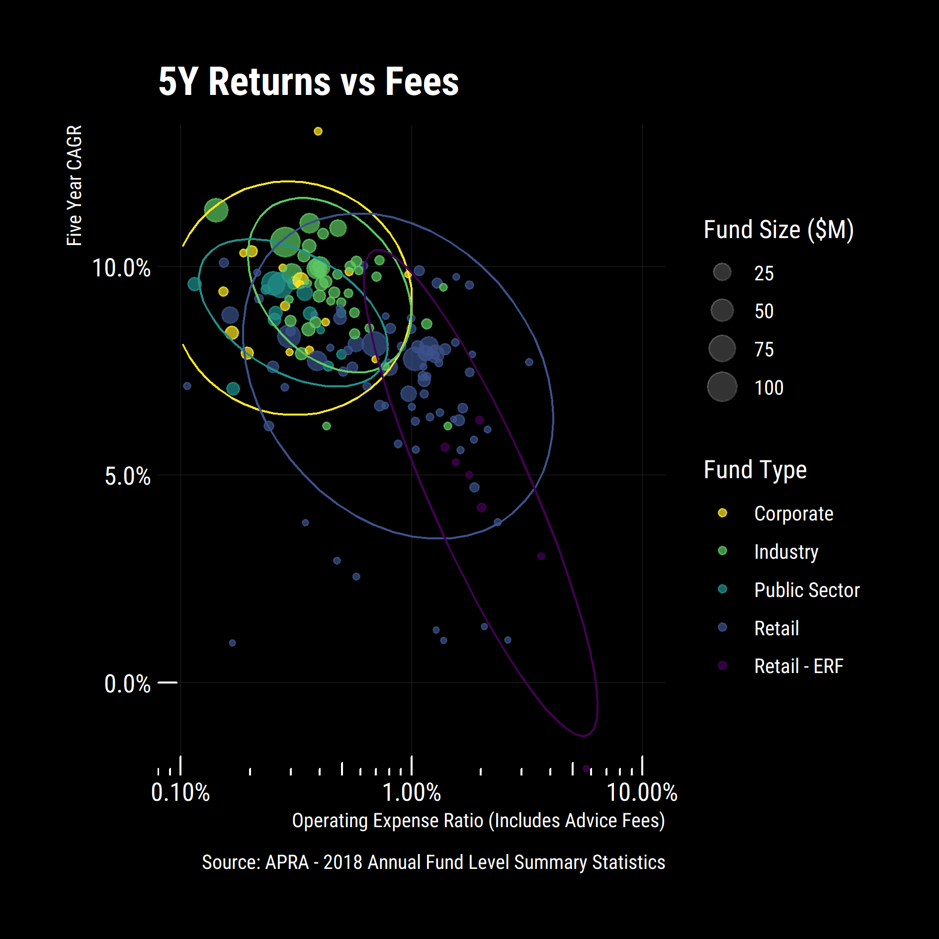
Some interesting general trends emerged:
- Eligible rollover funds (ERF) are expensive and have poor returns so it pays to consolidate your super.
- Industry funds have lower fees and higher returns than retail funds
- Corporate funds have comparable or lower fees than industry funds for similar returns (Except for the Goldman Sachs & JBWere Superannuation fund)
- Economies of scale are at play with large funds typically having lower fees and higher returns than smaller funds
I zoomed in on the cluster of funds with Operating Expense Ratios between 0.1% and 3% with 5-year returns above the median. Could I even get into all of these funds?
  df %>%
  filter(five_year_rate_of_return >= median(five_year_rate_of_return, na.rm = T)) %>%
  filter(operating_expense_ratio >= 0.001) %>%
  ggplot(aes(x = operating_expense_ratio,
             y = five_year_rate_of_return,
             colour = fund_type,
             size = net_assets_at_beginning_of_period / 1e6,
             label = fund_name,
             shape = rse_regulatory_classification))+
  geom_point(alpha = 0.7)+
  scale_x_log10(limits = 10^c(-3,-1.5),
                breaks = 10^c(-3:-1),
                labels = scales::percent_format())+
  scale_y_percent(limits = c(0.08, .14))+
  scale_colour_viridis_d(direction = -1)+
  ggrepel::geom_text_repel(data = top_n(df, 5, five_year_rate_of_return), size= 2.5, alpha= 0.5, direction = "y", nudge_x = 0.01, show.legend = F)+
  scale_size_continuous(guide = guide_legend(override.aes = list(colour = "white", alpha = 0.2))) +
  scale_shape_manual(values = c(1,19),
                     guide = guide_legend(override.aes = list(colour = "white", alpha = 0.2)))+
  labs(title = "5Y Returns vs Fees",
       caption = "Source: APRA - 2018 Annual Fund Level Summary Statistics",
       x = "Operating Expense Ratio (Includes Advice Fees)",
       y = "Five Year CAGR",
       size = "Fund Size ($M)",
       shape = "Offer Type",
       colour = "Fund Type")+
    dark_theme+
  annotation_logticks(sides="b", colour = "white")

  ggsave("plot/03 Returns vs Fees.png",
         width = 5,
         height = 5,
         units = "cm",
         dpi = 320,
         scale = 3
  )
Some new general trends emerged:
- Most corporate funds are not publicly available (makes sense) and are less expensive then retail funds or industry funds
- Some industry funds are non-public (Unisuper, Meat Industry Employees, Victorian Independent Schools etc)
Was the trend the same over 10 years or was this a recent phenomenon?
df %>%
  filter(ten_year_rate_of_return >= median(ten_year_rate_of_return, na.rm = T)) %>%
  filter(operating_expense_ratio >= 0.001) %>%
  ggplot(aes(x = operating_expense_ratio,
             y = ten_year_rate_of_return,
             colour = fund_type,
             size = net_assets_at_beginning_of_period / 1e6,
             label = fund_name,
             shape = rse_regulatory_classification))+
  geom_point(alpha = 0.7)+
  scale_x_log10(limits = 10^c(-3,-1.5),
                breaks = 10^c(-3:-1),
                labels = scales::percent_format())+
  scale_y_percent(limits = c(0.03, 0.075))+
  scale_colour_viridis_d(direction = -1)+
  ggrepel::geom_text_repel(data = top_n(df, 5, ten_year_rate_of_return), size = 2.5, alpha= 1, direction = "y", nudge_x = 0.01, show.legend = F)+
  scale_size_continuous(guide = guide_legend(override.aes = list(colour = "white", alpha = 0.2))) +
  scale_shape_manual(values = c(1,19),
                     guide = guide_legend(override.aes = list(colour = "white", alpha = 0.2)))+
  labs(title = "10Y Returns vs Fees",
       caption = "Source: APRA - 2018 Annual Fund Level Summary Statistics",
       x = "Operating Expense Ratio (Includes Advice Fees)",
       y = "Ten Year CAGR",
       size = "Fund Size ($M)",
       shape = "Offer Type",
       colour = "Fund Type")+
  annotation_logticks(sides = "b", colour = "white")+
  dark_theme

ggsave("plot/04 10Y Returns vs Fees.png",
       width = 5,
       height = 5,
       units = "cm",
       dpi = 320,
       scale = 3
)
The trends were very similar, some movement in the top left but the overall positions were the same indicating systematic factors. I then looked at how the funds compare regarding returns per unit of operating cost. As before, I focused and labelled only the top 20% of funds.
performance_ratios = df %>% mutate(operating_performance_ratio = five_year_rate_of_return / operating_expense_ratio,
              investment_performance_ratio = five_year_rate_of_return / investment_expenses_ratio) %>%
  filter(operating_performance_ratio != Inf)

df %>%
  ggplot(aes(x = operating_performance_ratio,
             y = five_year_rate_of_return,
             colour = fund_type,
             size = net_assets_at_beginning_of_period / 1e6,
             label = fund_name,
             shape = rse_regulatory_classification))+
  geom_point(alpha = 0.7)+
  scale_x_log10(limits = c(0.1, 100))+
  scale_y_percent()+
  scale_colour_viridis_d(direction = -1)+
  scale_size_continuous(guide = guide_legend(override.aes = list(colour = "white", alpha = 0.2))) +
  scale_shape_manual(values = c(1,19),
                     guide = guide_legend(override.aes = list(colour = "white", alpha = 0.2)))+
  ggrepel::geom_text_repel(data = filter(performance_ratios,
                                         operating_performance_ratio > quantile(operating_performance_ratio,0.8) &
                                         rse_regulatory_classification == "Public offer") %>%
                             top_n(5, operating_performance_ratio * five_year_rate_of_return),
                           size=3,
                           alpha = 0.8,
                           nudge_x = -1.5,
                           direction = "x",
                           show.legend = F)+
  labs(title = '5Y Returns vs Operating Performance Ratio',
       caption = "Source: APRA - 2018 Annual Fund Level Summary Statistics",
       x = "Operating Performance Ratio (Including Advice Fees)",
       y = "Five Year CAGR",
       size = "Fund Size ($M)",
       shape = "Offer Type",
       colour = "Fund Type")+
  dark_theme


ggsave("plot/05 Operating Performance Ratios.png",
       width = 5,
       height = 5,
       units = "cm",
       dpi = 320,
       scale = 3
)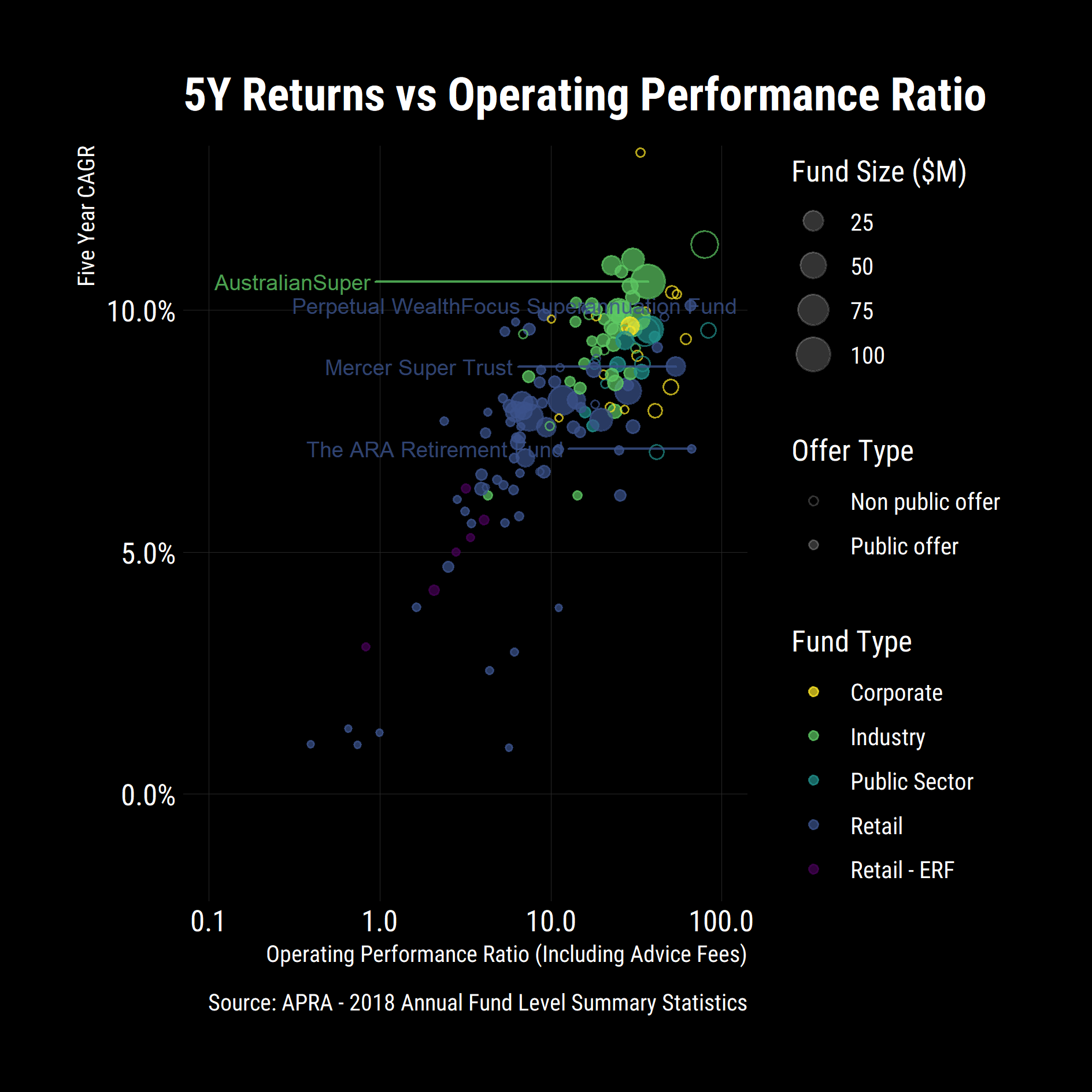
Goldman Sachs was still up the top but Unisuper, Perpetual WealthFocus and the Public Sector funds were now at the top of the pack however Unisuper was and still is closed to the public and I am personally not a fan of small funds from a risk perspective. My preferred option was a large fund, with good performance per unit cost and returns. To codify that criteria, I focused on publicly available funds that are in the top 20% of funds by performance ratio and returns.
pick = performance_ratios %>%
  filter(rse_regulatory_classification == "Public offer") %>%
  filter(five_year_rate_of_return >= quantile(five_year_rate_of_return, 0.8) &
           net_assets_at_beginning_of_period >= quantile(net_assets_at_beginning_of_period, 0.8)) %>%
  top_n(n = 1, operating_performance_ratio)

pick %>% str()
Classes 'tbl_df', 'tbl' and 'data.frame': 1 obs. of  87 variables:
 $ fund_name                     : chr "AustralianSuper"
 $ abn                           : num 6.57e+10
 $ rse_regulatory_classification : chr "Public offer"
 $ fund_type                     : chr "Industry"
With these metrics and a five-year outlook, my fund was getting thoroughly out-competed. As a result, I started a process to consolidate my Superannuation and swap providers.
Obviously, this is subjective to my circumstance, and I am certainly not a financial adviser so don’t view this as advice, focus instead on the techniques and methods of data manipulation and analysis and see what other data sets you can find to benchmark against.