Beyond Excel: An engineers perspective
“All models are wrong, but some are useful.” - George Box, 1976
In the previous post, I walked through a quick example of an analysis in R. In this post I will demonstrate part of a simulation workflow that leveraged the mapping functions from R’s preeminent Tidyverse library. Building models and performing simulations is a crucial skill for Process Engineers. Models allow us to ask questions, optimise constraint problems and test ideas without the risk of affecting plant run-time or product specification.
I am a big fan of ‘investing in time-saving tools’ and building your own tools to ‘scale your impact’. Using a programming environment instead of Excel allows you to write concise functions that do one thing well then build other functions that amplify the utility of the first function. Very rapidly you start to identify common problems and opportunities to generalise your solutions. Your project builds upon itself as the prior functions become the scaffold for the next layer. With Excel, you can reuse models through the scenario manager, goal seek and data table functions but they are not particularly user-friendly. Secondly, I find these tools difficult to reuse or integrate into larger models while a programming environment like R, overcomes these issues.
We recently used this methodology to build a high-level model of a Coal Handling and Processing Plant (CHPP) that could quantify the interactions of Feed Rate and Size Distribution on product yield. This post will walk through how we used R to model the Dense Medium Cyclones.
Background
Some quick Coal 101. Coarse coal is upgraded by separating low-density coal from high-density rock. Ultrafine Magnetite is added to water to generate a Medium with a controlled slurry density (often referred to as the Specific Gravity or SG). Material with a lower density than the medium floats while higher density material sinks. Particles will sink given enough time, but to accelerate the process, Dense Medium Cyclones (DMCs) amplify the density differentials and rapidly separate light product coal to the overflow and dense rejects to the underflow. The fraction of feed reporting to the product is predicted using the following partition equation:
\[R = 100 - \left(t_0 + \left(t_{100} - t_0 \right) \over 1 + e^{1.0986 \times \left( \rho_{50} - \rho \right) \over Ep} \right)\]The two most important parameters are the Density Cutpoint $\rho_{50}$ and the $Ep$. These characterise the target density to split the stream into product and reject is and how efficient the separation is. The two $t$ parameters account for bypassing of products and rejects and are close to 0 and 100 for efficient DMC operation.
The Partition Function
In R, we created a function to calculate the recovery for a density fraction given the four parameters described above. Note that default parameters are provided and can be overridden by the user as needed.
apply_partition_curve = function( float_sink_table,
                                  ep = 0.005,
                                  cutpoint = 1.5,
                                  t_0 = 0,
                                  t_100 = 100 ){
  float_sink_table %>%
    mutate(recovery_to_product = (100 - (t_0 + (t_100 - t_0) / (1 + exp((1.0986 * (cutpoint - floats) / ep))))) / 100,
           recovery_to_reject = 1 - recovery_to_product,
           cutpoint = cutpoint,
           Ep = ep,
           t_0 = t_0,
           t_100 = t_100)
}
To determine that the function works, we create a data frame with SGs from 1 to 2.2 and calculate the recoveries to each stream.
pacman::p_load(tidyverse, magrittr, ggthemr, hrbrthemes, stringr)

df = data.frame(floats = seq(from = 1, to = 2.2, by = 0.005))

partition_curve = df %>%
  apply_partition_curve(ep = 0.05)

## Plot partition Curve
partition_curve %>% ggplot(aes(floats, recovery_to_product)) +
  geom_line(colour = "red")+
  scale_y_continuous(labels = scales::percent_format())+
  labs(title = "JKMRC Partition Curve",
       subtitle = "D50 = 1.5 SG, Ep = 0.05",
       x = "SG",
       y = "Recovery to Product (%)")+
  dark_theme

ggsave(
  "plot/01 Partition Curve.png",
  width = 5,
  height = 5,
  units = "cm",
  dpi = 320,
  scale = 3
)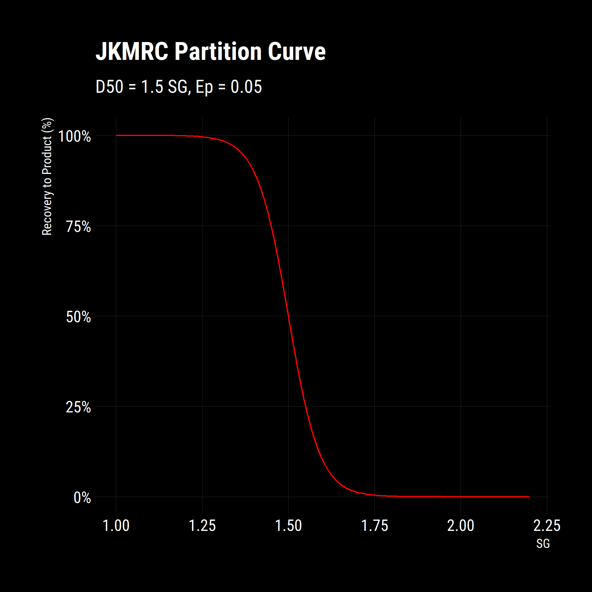
It is clear that the function works as expected from the above plot. Now, what if we wanted to explore the impacts of changing Ep on the separation? The purrr package has a set of potent map functions that allow you apply a function to each element of a list or vector. Additionally, the map functions give you granular control over how to process the results, i.e. combine results into a table, a vector or keep them as a list. This is a powerful workflow as repeatedly applying a function to new data-sets is a common task in simulation.
Map Functions
In the code, we generate a vector of Eps using the sequence function ($seq$) and map the partition curve function to this vector by using the pipe operator ($\%>\%$). By using $ map\_df$, we are telling R to combine the results into a data-frame. Mapping defaults to iterating on the first parameter and as the Ep is the second parameter in our function; we will use the tilde notation—to define an anonymous function—so we can explicitly specify the variable to map over.
## Demonstrate Mapping
Eps = seq(0.005, 0.2, 0.02)

partition_curves = Eps %>% map_df(~ apply_partition_curve(df, ep=.))
The output is a table that looks like this:
+--------+---------------------+--------------------+----------+-------+-----+-------+
| floats | recovery_to_product | recovery_to_reject | cutpoint |  Ep   | t_0 | t_100 |
+--------+---------------------+--------------------+----------+-------+-----+-------+
|      1 |                   1 |                  0 |      1.5 | 0.005 |   0 |   100 |
|  1.005 |                   1 |                  0 |      1.5 | 0.005 |   0 |   100 |
|   1.01 |                   1 |                  0 |      1.5 | 0.005 |   0 |   100 |
|  1.015 |                   1 |                  0 |      1.5 | 0.005 |   0 |   100 |
|   1.02 |                   1 |                  0 |      1.5 | 0.005 |   0 |   100 |
|  1.025 |                   1 |                  0 |      1.5 | 0.005 |   0 |   100 |
+--------+---------------------+--------------------+----------+-------+-----+-------+
We can plot this table using the same set of instructions as above but this time we will include a $colour$ and $group$ aesthetic that tells $ggplot$ to colour the lines in the plot by the Ep column.
partition_curves %>% ggplot(aes(x = floats,
                                y = recovery_to_product,
                                colour = Ep,
                                group = Ep)) +
  geom_line()+
  scale_colour_viridis_c(direction = -1)+
  scale_y_continuous(labels = scales::percent_format())+
  labs(title = "JKMRC Partition Curves",
       subtitle = "D50 = 1.5 SG",
       x = "SG",
       y = "Recovery to Product (%)")+
  dark_theme

ggsave(
  "plot/02 Partition Curves.png",
  width = 5,
  height = 5,
  units = "cm",
  dpi = 320,
  scale = 3
)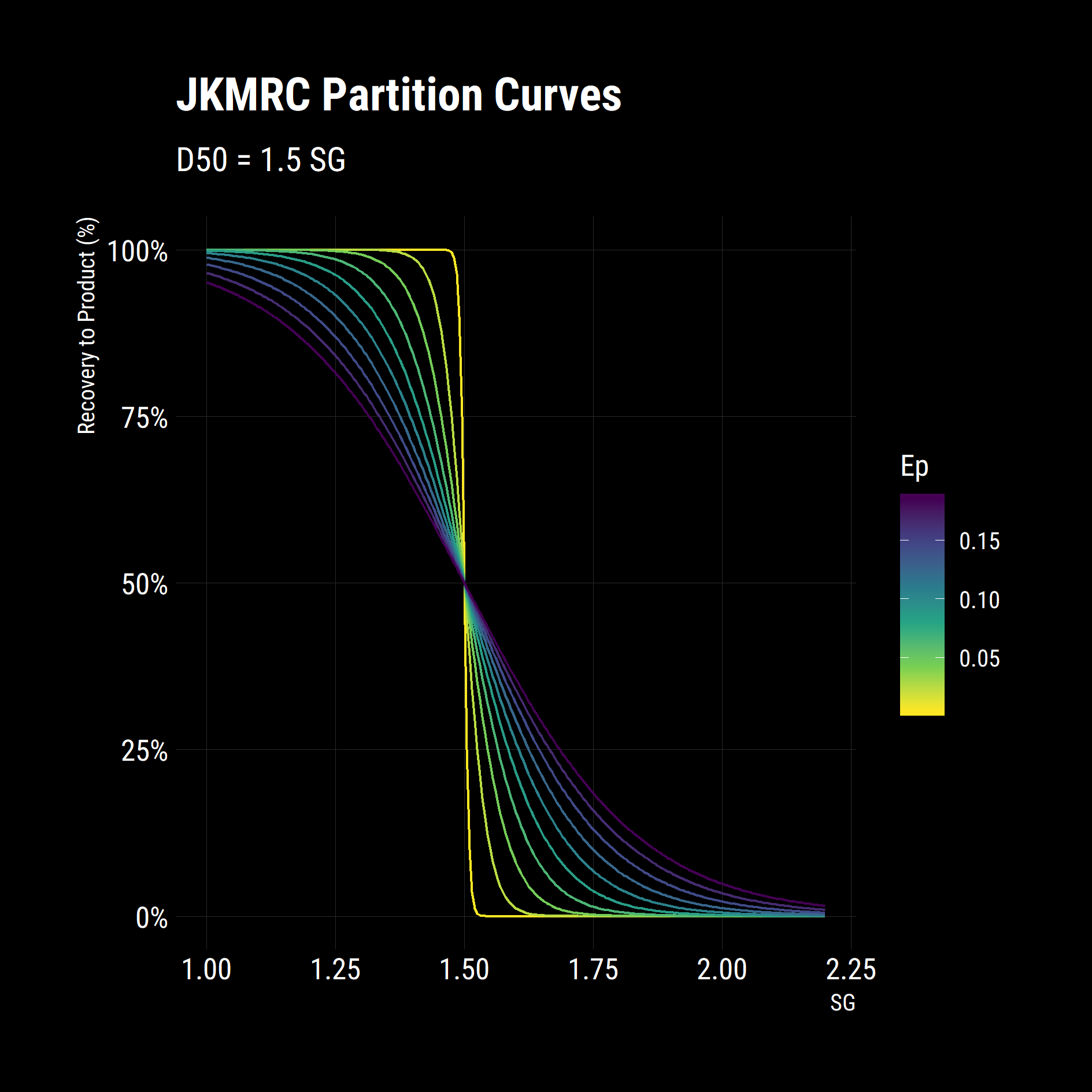
In a few lines of code, we have set up a table of SGs, defined an equation for partition and quantified the impact of changing one its parameters. From the figure above, higher Eps give poor, shallow separation curves while low Eps give steep, efficient separations.
Summarising Partition Curves
We now have a useful model for predicting the behaviour of the material in a DMC. What we want to see now is how they would perform on a given feed. To do this, we have a sample under Float-Sink testing to determine the distribution of particle densities or the washability of the sample. The results from a lab typically come in the format below. The mass and ash of each increment is recorded as they are progressively floated out of the sample at different medium densities.
float_sink

+---------------------+-------+--------+---------------+--------------+
| float_sink_fraction | sinks | floats | fraction_mass | fraction_ash |
+---------------------+-------+--------+---------------+--------------+
| F1.28               |       |   1.28 |            25 |          4.5 |
|  S1.28 - F1.30      |  1.28 |    1.3 |           7.3 |          7.9 |
|                 ... |   ... |    ... |           ... |          ... |
+---------------------+-------+--------+---------------+--------------+
To simulate this feed entering a DMC, we apply the partition curve function to each density fraction then multiply through by the mass fraction to calculate the mass of product and reject in each density increment. We do some minor data reshaping to get the data into a tidy data set or Third Normal Form.
partition_results %>%
  gather(key,value, -(1:11)) %>%
  mutate(key = factor(key, c("Reject","Product"))) %>%
  ggplot(aes(x = float_sink_fraction,
             y = value/100,
             fill = key))+
    geom_col()+
  scale_fill_viridis_d()+
  scale_y_continuous(labels = scales::percent_format())+
  labs(title = "Partition of Float Sinks",
       x = "SG",
       y = "Mass Fraction (%)")+
  dark_theme+
  theme(axis.text.x = element_text(size = 8))+
  no_legend_title()+
  legend_bottom()

ggsave(
  "plot/03 Float Sinks Partitioned.png",
  width = 5,
  height = 5,
  units = "cm",
  dpi = 320,
  scale = 3
)
Notice how some of the bars (S1.3/F1.35 - S1.60/F1.70) have a mixture of both products and rejects. This reflects the imperfection in the separation on product recovery. What we now want to look at is the quantity of product made from this feed (its yield) and the quality (cumulative ash) with this set of partition parameters.
# Write a summary function
partition_yields = function(tbl) {
  tbl %>% mutate(
    product_mass = fraction_mass * recovery_to_product,
    product_ash = fraction_ash * product_mass,
    reject_mass = fraction_mass * recovery_to_reject,
    reject_ash = fraction_ash * reject_mass
  ) %>%
    select(product_mass, product_ash, reject_mass, reject_ash) %>%
    summarise_all(sum) %>%
    mutate(product_ash = product_ash / product_mass,
           reject_ash = reject_ash / reject_mass) %>%
    bind_cols(tbl %>% select(cutpoint:t_100) %>% unique())
}

partition_results %>% partition_yields()
The result of our partition yields function is a single row summarising the product made with the separation conditions we specified.
+--------------+-------------+-------------+------------+----------+------+-----+-------+
| product_mass | product_ash | reject_mass | reject_ash | cutpoint | Ep | t_0 | t_100 |
+--------------+-------------+-------------+------------+----------+------+-----+-------+
| 87.5 | 9.7 | 12.5 | 62.5 | 1.6 | 0.05 | 0 | 100 |
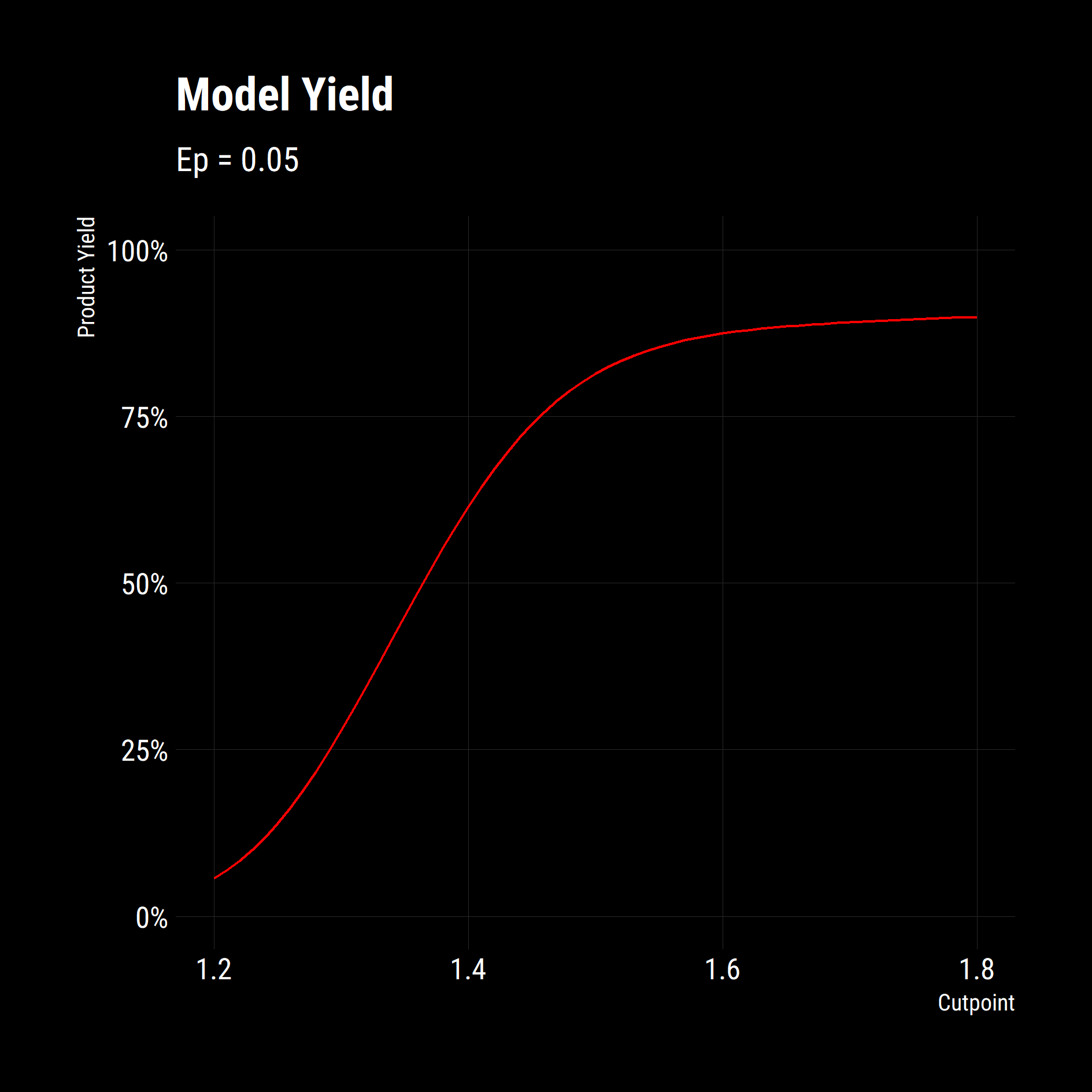
+--------------+-------------+-------------+------------+----------+------+-----+-------+Let’s leverage our mapping functions again to look at the yields at different cut-points using our summary function. We use an anonymous function (~) in the first map as the piped variable — a vector of cut-points — is not the first argument of the $apply\_partition\_curve$ function but the resulting data frames are the argument in the second call to map. Note the $map\_df$ to combine results.
# Now try for many cutpoints
cutpoints = seq(1.2, 1.8, 0.01)

# Use map from purrr to run with various inputs
# last line outputs a dataframe and the map_df call binds them
df_partition_yields = cutpoints %>%
  map(~ apply_partition_curve(
    float_sink_table = float_sink,
    cutpoint = .,
    ep = 0.05
  )) %>%
  map_df(partition_yields)

head(df_partition_yields)

# now we are plotting the summaries of many simulations
df_partition_yields %>%
  ggplot(aes(x = cutpoint,
             y = product_mass/100)) +
  geom_line(colour = "red") +
  scale_y_continuous(labels = scales::percent_format(),
                     limits = c(0,1))+
  labs(title = "Model Yield",
       subtitle = "Ep = 0.05",
       x = "Cutpoint",
       y = "Product Yield")+
  dark_theme


  ggsave(
    "plot/04 Model Yields.png",
    width = 5,
    height = 5,
    units = "cm",
    dpi = 320,
    scale = 3
  )
The results of this is the following graph of yield against cutpoint. Now we are really getting somewhere. We have functions to model a separation process, we have functions that apply the unit operation to a feed and we have a summarising function that combined the two. We can now quantify the impact of changing separation parameters on the Product Yield and Quality on our feed or on any feed.
Multiple Parameters
As a final example, we will examine the impact of Cutpoint and Ep on product yield simultaneously. There are multiple ways of writing code to do this. We could create multiple lists of parameters and map over them using $map2$ or $pmap$ but I find it easier to use the $cross$ function from $purrr$ to make a grid of combinations, then solve for each position in the matrix.
df_yields_ep %>%
  mutate(ep = as.factor(ep)) %>%
  ggplot(aes(
    x = cutpoint,
    y = product_mass / 100,
    group = ep,
    colour = ep
  )) +
  geom_line() +
  scale_colour_viridis_d() +
  scale_y_continuous(labels = scales::percent_format()) +
  labs(
    title = "Recovery Curves",
    subtitle = "Sensitivity Analysis on Ep",
    x = "Cutpoint",
    y = "Product Yield",
    colour = "Ep"
  ) +
  dark_theme +
  legend_bottom()

ggsave(
  "plot/05 Recovery Curves.png",
  width = 5,
  height = 5,
  units = "cm",
  dpi = 320,
  scale = 3
)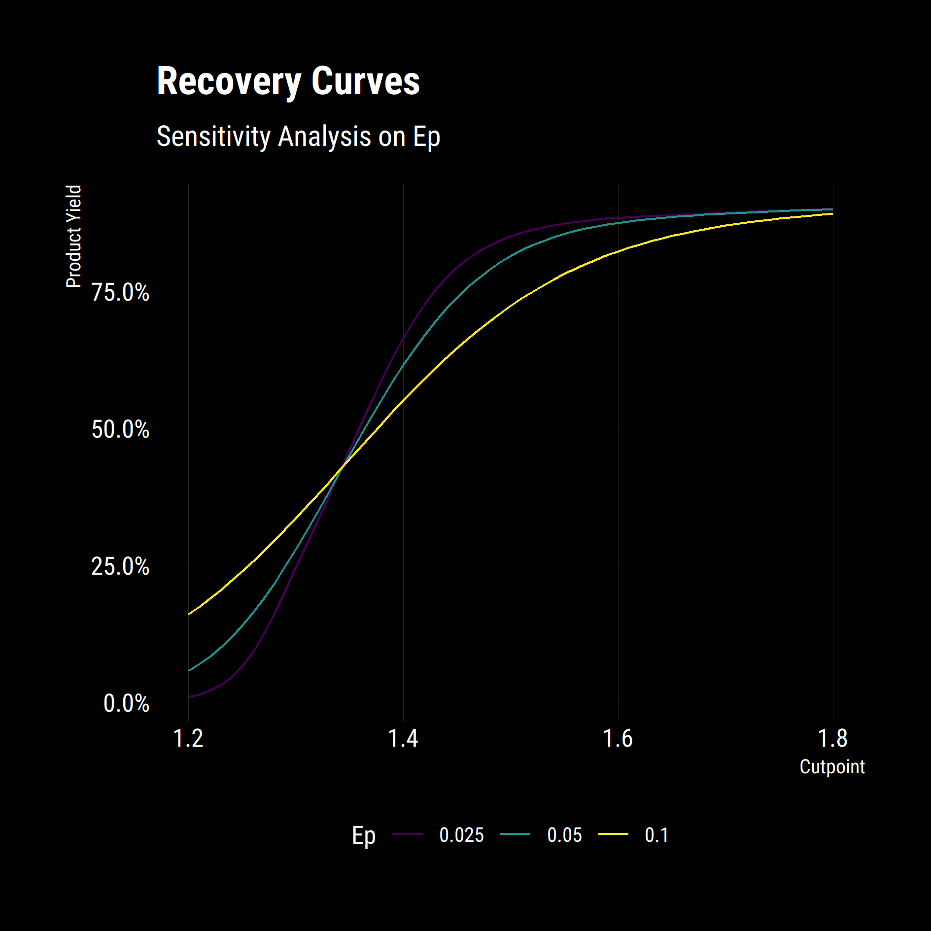
The model behaves as expected. Low Ep operations have substantially higher Yields at high cut-points and misplace less material at lower cut-points.
Conclusion
Excluding the graphs, the model boils down to just a partition equation and a summary function.
apply_partition_curve = function(float_sink_table,
 ep = 0.005,
 cutpoint = 1.5,
 t_0 = 0,
 t_100 = 100){
  # Requires a tibble with a floats column <dbl>
  float_sink_table %>%
    mutate(recovery_to_product = (100 - (t_0 + (t_100 - t_0) / (1 + exp((1.0986 * (cutpoint - floats) / ep))))) / 100,
           recovery_to_reject = 1 - recovery_to_product,
           cutpoint = cutpoint,
           Ep = ep,
           t_0 = t_0,
           t_100 = t_100)
}


partition_yields = function(tbl) {
  tbl %>% mutate(
    product_mass = fraction_mass * recovery_to_product,
    product_ash = fraction_ash * product_mass,
    reject_mass = fraction_mass * recovery_to_reject,
    reject_ash = fraction_ash * reject_mass
  ) %>%
    select(product_mass, product_ash, reject_mass, reject_ash) %>%
    summarise_all(sum) %>%
    mutate(product_ash = product_ash / product_mass,
           reject_ash = reject_ash / reject_mass) %>%
    bind_cols(tbl %>% select(cutpoint:t_100) %>% unique())
}

conditions = list(cutpoint = seq(1.2, 1.8, 0.01),
                  ep = c(0.025, 0.05, 0.1)) %>%
  cross()

df_yields_ep = conditions %>%
  map(~ apply_partition_curve(
    float_sink_table = float_sink,
    cutpoint = .$cutpoint,
    ep = .$ep
  )) %>%
  map_df(partition_yields)
This code was then wrapped up into an overarching model that calculated Eps from plant feed rate and simulated the Dense Medium Baths (DMB) and Teeter Bed Separators (TBS) with the $apply\_partition\_equation$.
I hope this example demonstrates how using small functions and some neat libraries in R, you can leverage your work for maximum benefit and allow you to focus your time on the analysis and evaluation of results instead of the computation.