XRF Assay Analysis on Circuit Concentrates
2020-01-01: Updated libraries and graph backgrounds
In this examples, I was undertaking Exploratory Data Analysis (EDA) on a data set generated by a portable Olympus X-Ray Fluorescence (XRF) analyser. The CSV generated was in a wide format with a single row per observation, columns for assays and confidence intervals for each element.
require(pacman)
pacman::p_load(tidyverse, ggthemr, ggrepel, hrbrthemes, tidyr)

df = read_csv("data/01 data.csv") %>%
  select(-contains("+/-")) %>%
  select(Date:`Elapsed Time Total`,
         `Live Time 1`:`Field 12`,
         everything()) %>%
  select(-contains("Field")) %>%
  mutate(Reading = str_remove(Reading,"\\#")) %>%
  separate(Reading,into = c("run","duplicate"), remove = F, sep="-") %>%
  filter(LocationID == "Concentrate") %>%
  filter(!is.na(duplicate)) %>%
  select(-(run:duplicate))

na_cols = names(df)[map_lgl(df, ~all(is.na(.)))]

df_tidy = df %>%
  select(-one_of(na_cols)) %>%
  mutate_at(vars(P:U), as.character) %>%
  pivot_longer(names_to = "element", values_to = "assay", -(Date:comment)) %>%
  mutate(assay = as.numeric(assay)) %>%
  filter(!is.na(assay))
The above code makes use of dplyr’s pipe function $\%>\% to pass the output of a function into the next function’s inputs which is similar to the concept of chaining functions in excel by linking cells. The functions are named well, and the use of verbs aids this self-documenting process, i.e. the above code performs the following:
- Reads a CSV
- Selects columns that don’t contain $.var$ in their name
- Rearranges the table by selecting the columns between $Datetime$ and $Elapsed Time Total$, then $Live Time 1$ and $Field 12$ then everything else
- Selects columns that don’t contain $Field$ in their name
- Creates two new columns by extracting digits out of a compound string
- Filter the results down to only Concentrate samples
- Exclude results that don’t have duplicates
- Remove the compound string columns
The second section transforms the data from a wide format to a narrow or ‘tidy’ format ready for analysis.
Below is some templating code to format the graphs for this post. I’ll assign them to a variable to avoid repetition.
dark_theme =   theme_ipsum_rc() +
  theme(
    panel.background = element_rect(fill = "black"),
    plot.background = element_rect(fill = "black"),
    legend.background = element_rect(fill = "black"),
    text = element_text(colour = "white"),
    axis.text = element_text(colour = "white"),
    panel.grid.major.x = element_line(colour = rgb(40, 40, 40, maxColorValue = 255)),
    panel.grid.major.y = element_line(colour = rgb(40, 40, 40, maxColorValue = 255))
  ) +
  no_minor_gridlines()
Once this preparation is complete, we are ready to start visualising the data, we pipe the tidy data into ggplot and ‘add’ geoms, or layers. Note that we specify the abscissa and ordinate axes explicitly, what factor to group the graphics by and what factor to colour them by and only then do we tell ggplot to add visualisation layers, in this case a boxplot. We then scale the y axis by log 10, flip the plot 90° and set the labels
df_tidy %>%
  ggplot(aes(
    x = reorder(element, assay, mean),
    y = assay,
    fill = reorder(element, assay, mean)
  )) +
  geom_boxplot(colour = rgb(100,100,100, maxColorValue = 255)) +
  scale_y_log10(breaks = 10 ^ (0:6),
                labels = scales::comma_format()) +
  coord_flip() +
  no_legend() +
  labs(title = "Distribution of Concentrations",
       x = "Element",
       y = "Assay (ppm)")+
  scale_fill_viridis_d()+
  dark_theme

# Save plots for this post
ggsave(
  "plot/01 Distributions.png",
  width = 5,
  height = 10,
  units = "cm",
  dpi = 320,
  scale = 3
)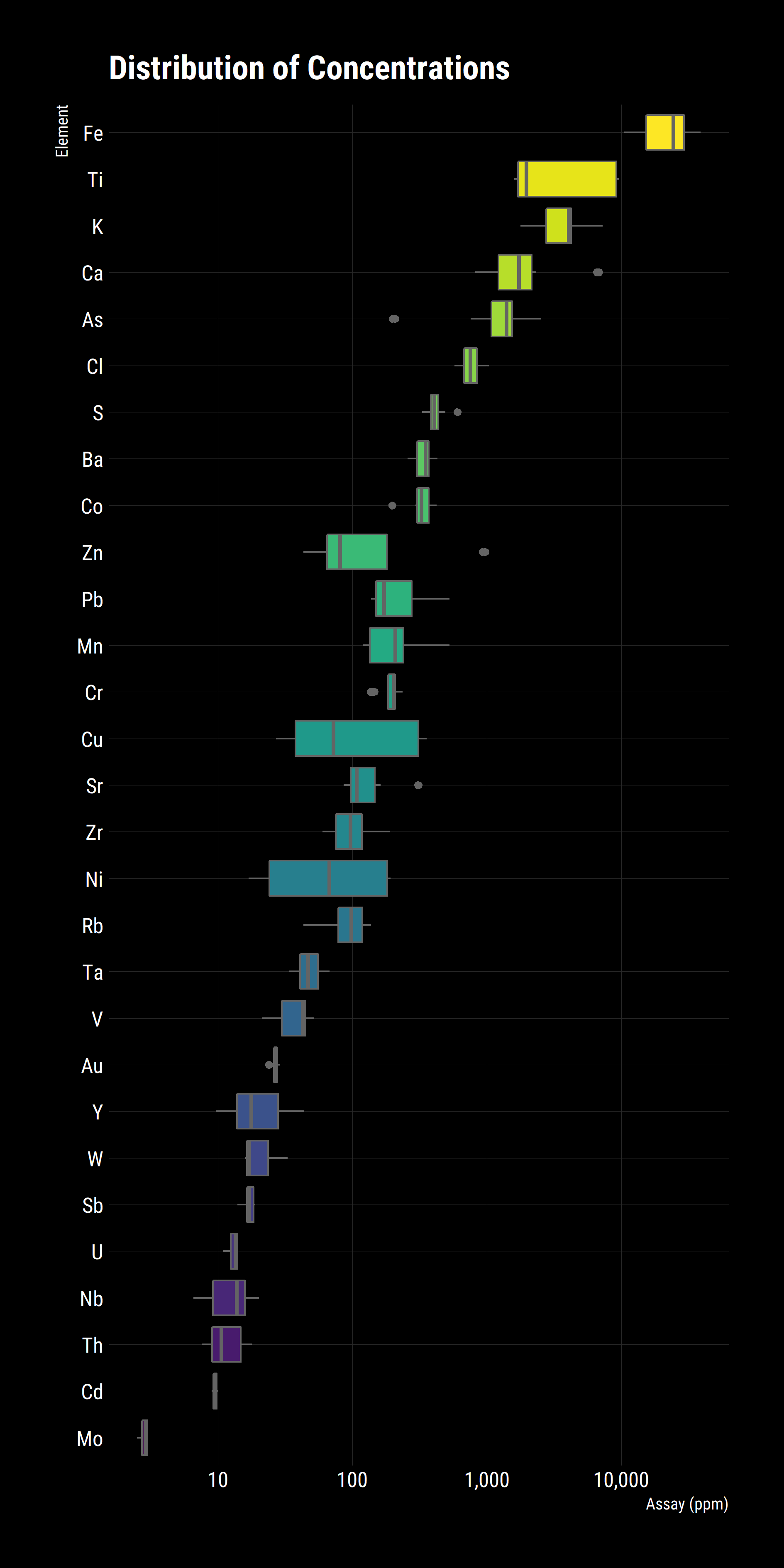
The above graph gives a good high level indication of the distribution of elements and the spread of them, we can already see that Ti, Cu and Ni have wide distributions while Ca, As and Zn have outliers. These results are taken from Flotation and Gravity Circuit Concentrates so a good follow up question would be if there are there any differences between the groups? In R, it’s trivial to break the analysis into subgroups. In the case, colour points based on their group.
df_tidy %>%
  mutate(
    source = if_else(comment == "float con", 'Flotation', 'Gravity'),
    source = if_else(is.na(comment), 'Gravity', source)
  ) %>%
  ggplot(aes(
    x = reorder(element, assay, mean),
    y = assay,
    colour = source
  )) +
  scale_colour_viridis_d(begin = 0.3)+
  geom_point(alpha = 0.5) +
  scale_y_log10(breaks = 10 ^ (0:6),
                labels = scales::comma_format()) +
  coord_flip() +
  legend_bottom() +
  no_legend_title() +
  labs(title = "Distributions by Feed",
       x = "Element",
       y = "Assay (ppm)")+
  dark_theme

ggsave(
  "plot/02 Distributions by Feed.png",
  width = 5,
  height = 10,
  units = "cm",
  dpi = 320,
  scale = 3
)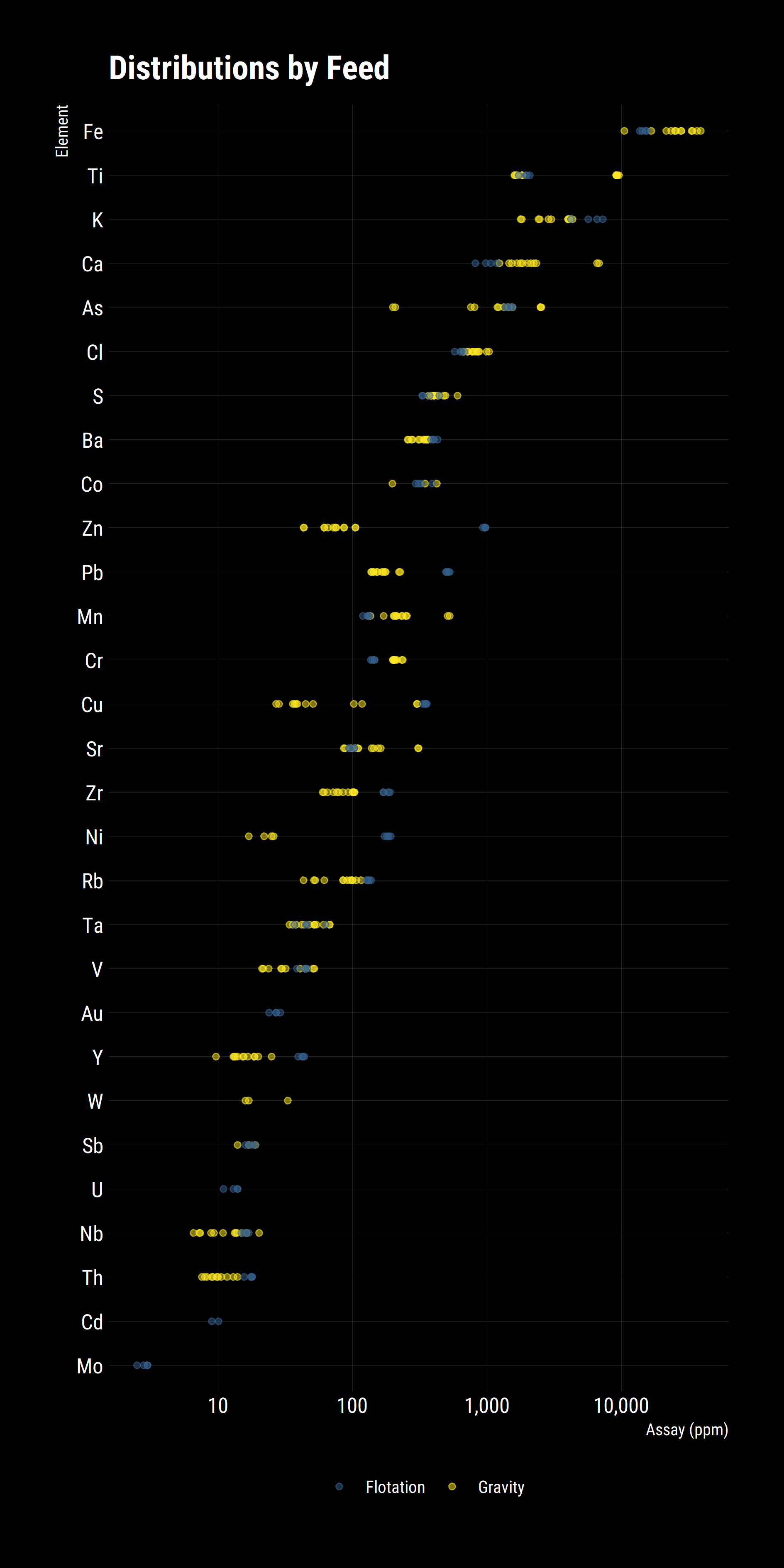
Some new patterns emerge from this plot.
- Gravity concentrates are richer in dense metals (Fe, Mn, Cr, W)
- Flotation concentrates have more fast-floating metals (Zn, Pb, Cu, Zr, Ni)
- Some species are detected only in one concentrate but not the other (Au, U, Cd, Mo)
- Some species are abundant in both (As, Ti, S).
This is better but it is a bit hard to spot trends, a slope plot would help rapidly identify changes in the groups. To do this, we group the data by source and element then summaries the results by averaging the assays.
df_tidy %>%
  mutate(
    source = if_else(comment == "float con", 'Flotation', 'Gravity'),
    source = if_else(is.na(comment), 'Gravity', source)
  ) %>%
  group_by(source, element) %>%
  summarise(assay = mean(assay)) %>%
  ggplot(aes(
    x = source,
    y = assay,
    colour = reorder(element, assay, mean),
    group = element
  )) +
  scale_colour_viridis_d()+
  geom_point(size = 2) +
  geom_line() +
  scale_y_log10(labels = scales::comma_format()) +
  geom_text_repel(aes(label = element), point.padding = .5) +
  no_legend() +
  no_x_gridlines() +
  annotation_logticks(sides = "l") +
  labs(title = "Feed Comparison",
       x = "Feed Source",
       y = "Assay (ppm)")+
  dark_theme

ggsave(
  "plot/03 Feed Comparison.png",
  width = 5,
  height = 10,
  units = "cm",
  dpi = 320,
  scale = 3
)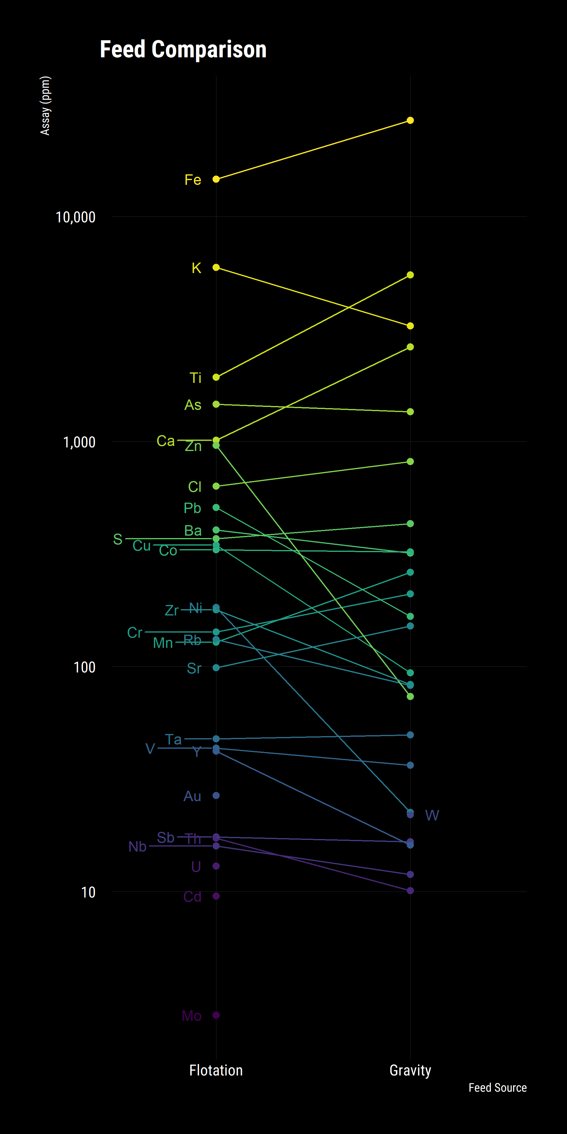
Whilst the above plot is illustrative, we aren’t able to determine if the differences between the concentrates is significant or not. To ascertain this, we utilise a volcano plot, commonly used in bioinformatics to compare change and significance between a binary pair.
Change is measured through the fold change, the base 2 logarithm of $(Condition - Base) / Base$. This is a nice, symetric property with equivalence between the condition and base case at zero on the abscissa. Signficance is negative base 10 logarithm of the p-value from a two-sided T-Test for equal means.
I used some helper functions and $map$ from the $purrr$ package.
Firstly, I wrote a helper function that performs a T-Test for a given column of a data frame and compares them by the $source$ factor which tell us which circuit the concetrate is from. The $broom$ package has a great function called $glance$ which tidues a T-Test’s output into a nice single row for analysis. I wrap this with the $possibly$ function to safely handle errors and return NULL in these instances.
Secondly, I created a vector of valid elements then convert that vector into a data frame and map the helper function over each element and unnest the result back into a tidy data frame for plotting.
glanced = function(x){
  equation = formula(str_c(x," ~ source"))
  t.test(equation, data = df) %>% broom::glance()
}

possible_glance = possibly(glanced, NULL)

elements = df %>%
  select(Al:U) %>%
  select_if(is.double) %>%
  select(-one_of(na_cols)) %>%
  colnames()

all_pairs = elements %>%
  as.data.frame() %>%
  mutate_all(as.character) %>%
  set_names(nm = "element") %>%
  group_by(element) %>%
  mutate(t_test = map(element, possible_glance)) %>%
  unnest() %>%
  mutate(fold_change = log2(estimate1 / estimate2),
         Significant = if_else(p.value <= 0.05, "Significant", "Not Significant"))
The plot is simple to produce; simply a scatter plot of significance and changes. Conditional formatting and some manual tweaking provides the right palette to communicate the results.
all_pairs %>%
  ggplot(aes(x = fold_change,
             y = -log10(p.value),
             label = element,
             colour = Significant))+

  scale_colour_manual(values = c("gray30","white"))+
  dark_theme+
  legend_bottom()+
  no_legend_title()+
  geom_point()+
  geom_text_repel(show.legend = F, size = 3)+
  geom_vline(xintercept = 0, colour = "red", linetype = "solid")+
  labs(x = "Fold Change [Log2(Flotation/Gravity)]",
       y = "Significance [-Log10(P Value)]",
       title = "Volcano Plot of Concentrates",
       subtitle = "Flotation compared Gravity",
       caption = "Fold Change represents a doubling and halfing.
       -Log10 is comparable to pH, higher value = lower [H3O+].
       Right  = Higher concentration compared to Flot Con
       Left   = Lower concentration compared to Flot con
       Higher = More significant result, lower p value") +
  scale_x_continuous(limits = c(-4,4), breaks = seq(-4, 4, 1))

ggsave(
  "plot/04 Volcano Plot.png",
  width = 5,
  height = 5,
  units = "cm",
  dpi = 320,
  scale = 3
)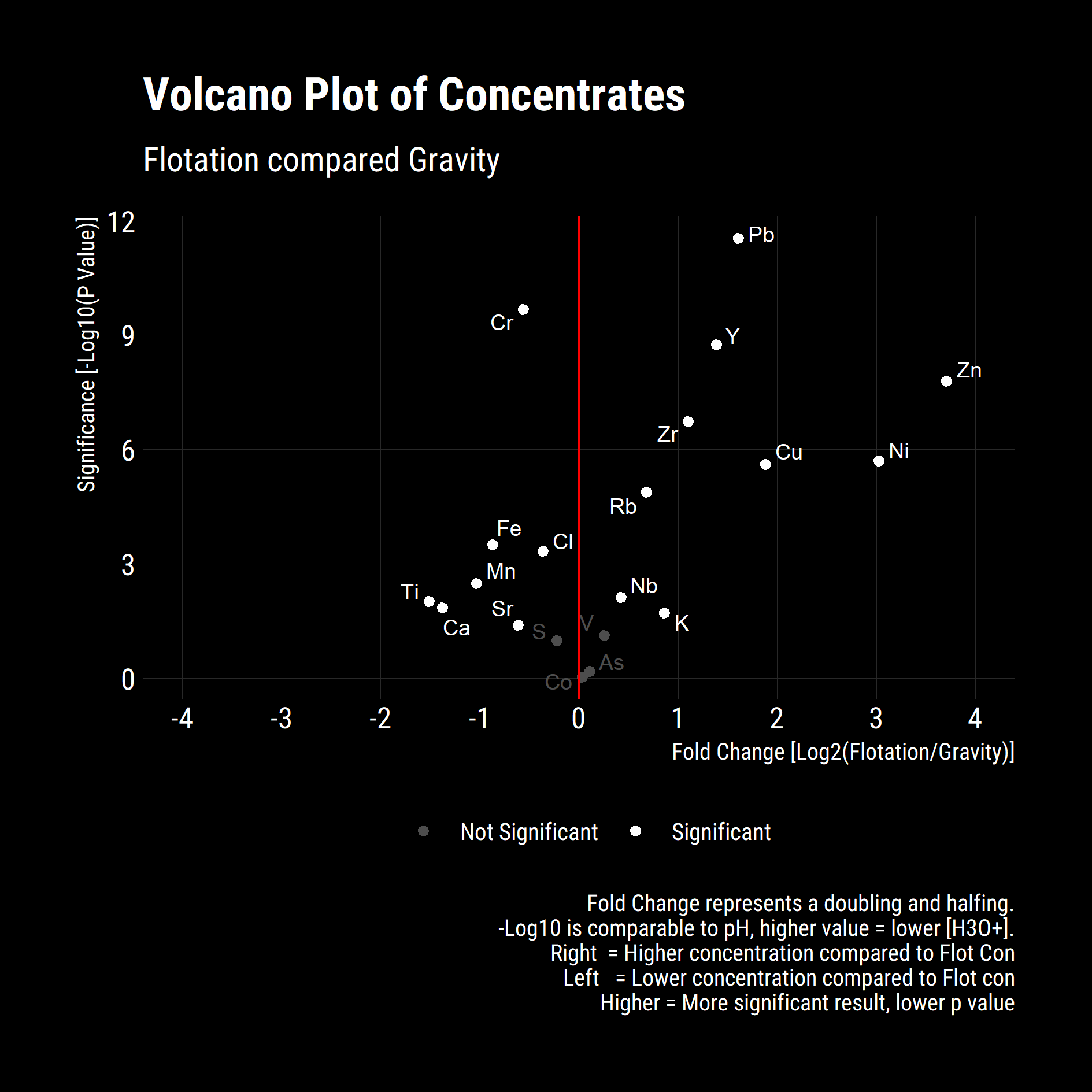
From the Above its clear that the increases in Zinc, Nickel, Copper and Lead in the flotation concentrate are significant. Significance reductions in Titanium, Calcium, Iron, Manganese and Chromium give insights into the mineral species that are being selectively recovered in the Flotation circuit relative to the Gravity circuit. Without XRD, MLA or additional assays, the exact mineralogy cannot be determined however we can speculate increased recovery of base metal sulphides, chiefly; Sphalerite, Chalcopyrite, Pentlandite and Galena with possible Pyrite rejection